- DATE:
- AUTHOR:
- Chris Holton

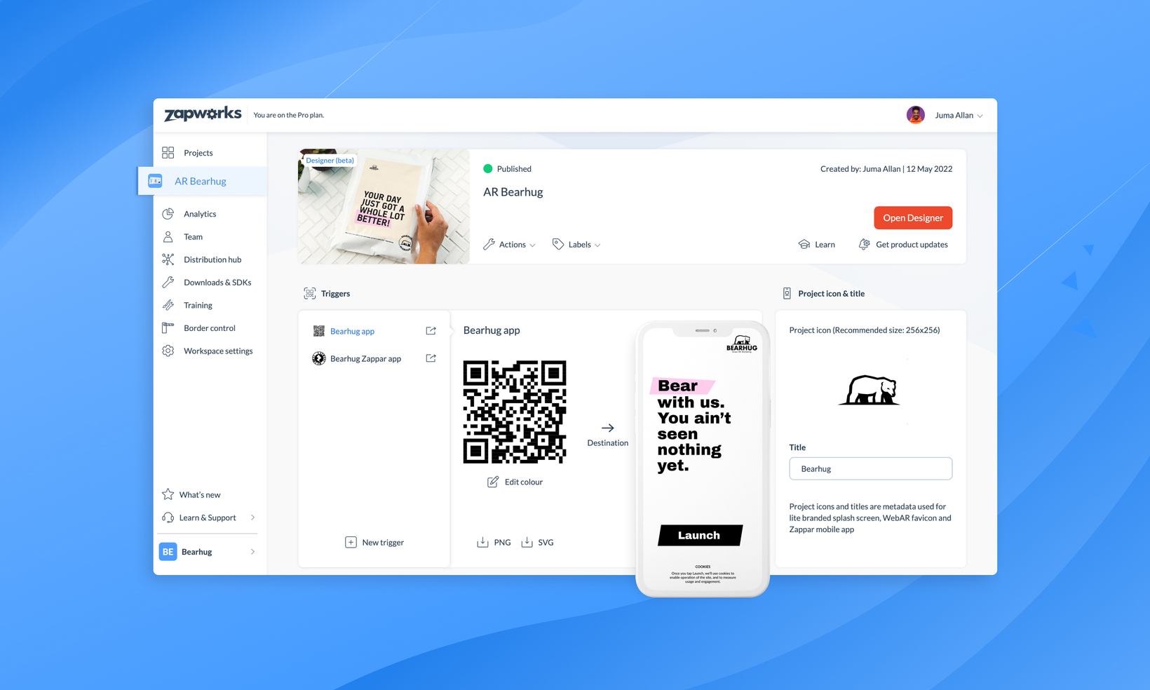
Greatly improved management of your ZapWorks projects
Today we have deployed an update to the ZapWorks CMS which offers a greatly improved user experience for managing your ZapWorks project. Here is a summary of the changes:
Prioritising trigger management.
With the increasing adoption of Enhanced WebAR and Lite Branded Distributions managing triggers and trigger destinations have become almost as important to a project as building the experience itself.
Because of this, we have moved the functionality to manage these from within a trigger’s page to the project overview page, where users can now:
Update the launch destination of their triggers
Edit the project icon and title of the Lite branded Distribution and publish changes without entering the tool
Update the colour of QR and Zapcodes
Change the trigger name and download PNG / SVG with the correct name
Create and publish Universal AR versions from within the homepage.
Improving the experience of the project page for Universal AR has been a core focus of this update. Developers now have much easier access to common functionality such as installing with npm, updating the destination of their triggers, publishing their project and viewing created versions.
Updated metrics on project page.
We have added two new metrics to the homepage, so you can now view ‘Most popular country’ and ‘Last 7 days views’ without having to leave the overview. You can continue to see the full page of analytics with customisable date ranges by clicking through to the project analytics page.
Consolidate multiple pages.
We have been able to remove the triggers overview and experience pages by exposing functionality from within the primary overview page. This offers a much smoother experience without having to switch between tabs.
Additional interface improvements.
We have refreshed the UI with a much-improved design aesthetic. There are a number of updates based on user feedback including displaying information such as publish status and created date, as well as fresh icons, graphics and greater use of empty states.
Check out this recording the outlines the differences between the old and new designs.
Along with this release, we have updated our Documentation site to reflect all these changes, so if anything is unfamiliar or unknown to you, you can always check there whilst you adjust.
I would like to say congratulations to the designers and engineers who put in a huge amount of work in getting this update live and looking so great.
On behalf of everyone on the team, I hope you like it! ✌️